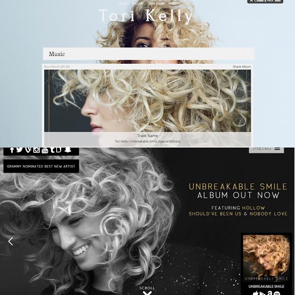
I created my website on Wix without looking at Tori Kelly's official website. After creating my site, I looked at her official site and drew some comparisons.
As you can see, the colour schemes of mine and the official website differ. The official website uses dark colours, mainly black and white to convey a simple, clean image of the artist. Although my website has a pale, pastel colour scheme, I think that the design still conveys the simplistic, clean cut image that the official website does. Much like mine, the official website's homepage ins't too cluttered, ensuring that the main focus is on the artist rather than anything else.
The font on the official website and mine are different. The official website uses a straight simple font, all in capital letters ensuring that the most important features of it stand out, for example, the album. Although the pictures that I have chosen to use are different, I think that they both convey similar things because they focus on an extreme close up of the face and the hair, which is a key, distinct feature of the artist.
Tori Kelly is a pop, RnB artist. I think her official website conveys the rock, more hard edge side of her then my website does. This is because of the dark colours used and the gold and black colour scheme.
Both my website and the official website have links for the artist's social medias. These are an important way for fans to be able to connect with the star and mean that they can become both present and absent simultaneously. Social media allows the artist and the fans to have a connection online, making them relateable and making the fans feel closer to them.
Both mine and the official website contain similar links. Both have a gallery and news pages. These enable fans to keep updated with the star and the gallery helps to maintain the image of the artist. Again, the colour schemes differ, with mine sticking to a more pastel, blue colour scheme and the official website black and gold.
Both of the gallerys contain similar photos which are mainly close ups of the artist's face, showing that they are the most important part of the website. many of the pictures on the official website are promoting her music to emphasises that it is what she is selling.
Overall, I would say that Tori Kelly is trying to convey an organic star image and I think both mine and her official website represent this. However, I think her official website come across as more synthetic than the one I have made.


No comments:
Post a Comment